Easily create rich responsive content for all devices
With an intuitive drag and drop interface, inline editor and ready to use text components, making creating stunning HTML5 content becomes quick and easy.
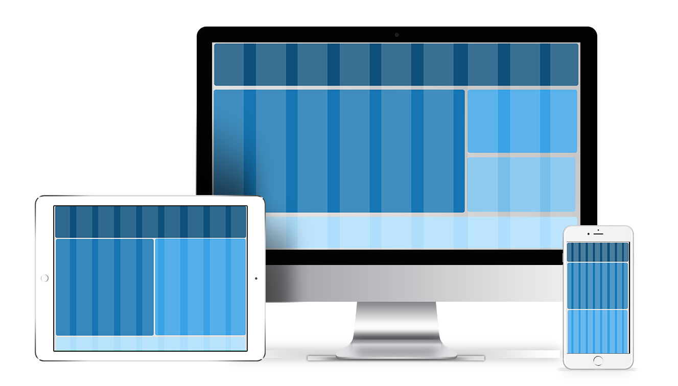
The built in responsive workspace lets you see exactly how your article looks as you're building it, while the preview option enables content to be tested on multiple device types before publishing.
Our responsive grid system enables you to instantly create robust, multi-column layouts and even define break points for complete content control.
Each component also offers 'component visibility' control, allowing you to manage what content is displayed on a device dependent basis.
Canvasflow comes with a large number of ready to use components for building responsive articles. We've got headers, footers, galleries, slideshows and even basic elements like spacers and and dividers.
With over 25 inbuilt and customisable media components, Canvasflow makes it easy to bring your content to life.
From maps and galleries, videos and tables and support for injecting complex custom code, creating engaging and interactive content becomes a breeze.
With link management, image captions, bleed-control and inbuilt aspect ratio cropping, each component is fully customisable.

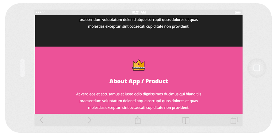
Important content gets the prominence it deserves
Quickly create hero blocks, customise callouts and apply on the fly. With no limit to the number of style blocks that can be added, your article design can be as unique the content.
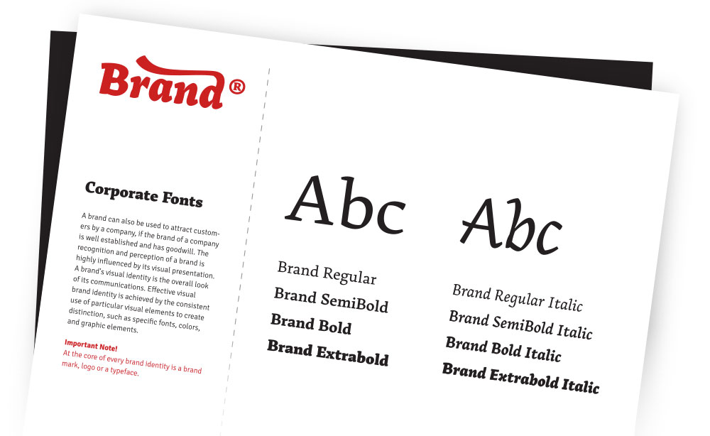
With native support for custom web fonts your message is always communicated perfectly and beautifully.
To ensure your content always looks stunning, fonts are automatically included with all published articles. And with WOFF2.0 compression as default, your content is delivered quickly.
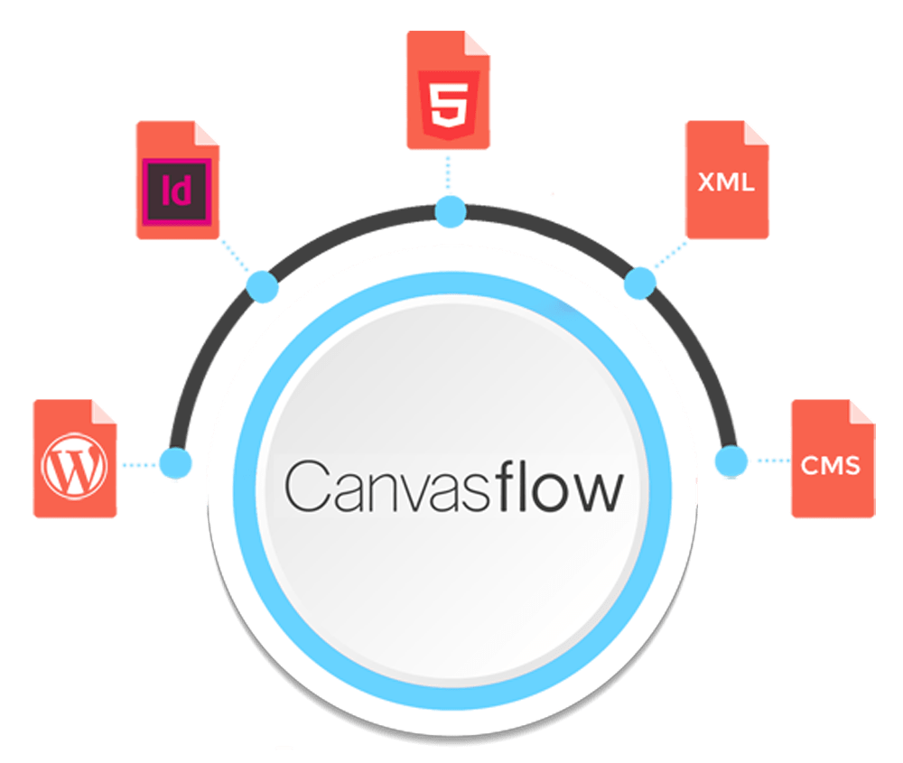
Whether you want to create articles on the fly, build from templates or fully automate the production process, Canvasflow has a solution that fits your budget.
With a robust API designed for high volume throughput and plugins for popular CMS platforms, Canvasflow offers a range of solutions that makes repurposing existing content simple.
With a built in preview mode, you can instantly see how content looks across multiple devices and orientations before publishing.
Download your content as a standalone article or seamlessly publish it to one of the many supported channels.
With specialized tools for working with a responsive grid, you can easily create, resize and manage columns - and even apply responsive visibility.
Unlimited media posabilities with the custom code component. Write HTML markup, add third party scripts or upload zip files containing custom code.
The inline text editor provides granular style level control over your copy, and with a customisable colour pallet your brand is always on point.
Switch instantly between the styles that are applied to an article and preview how your content can look in realtime.
Our platform offers full HTTPS encryption using TLS 1.3 and HTTP/2 for the best security and fastest delivery.
All images are automatically optimised and with built in cropping tools and aspect ratio detection, you get the perfect image every time.
Streamline your workflow by creating reusable templates each with linked styles. You can even create a template from an existing article.
You can export your content as standalone static articles at anytime and use it whereever you wish - no platform lockin.